Wayfinding: Tips to creating a building that all can navigate
Navigating the world is an activity that most people take for granted, as they rely on their sight to go everywhere. However, for people who are blind or have vision loss or limitations, navigating the world around them can be a complex challenge, as the built environment is filled with physical obstacles. In this blog we will explore a few ways to create accessible navigation in buildings, which will involve a combination of tactile, auditory, and technological solutions.
Braille Signage
Having braille signage throughout buildings is recommended. However, braille signage must be complemented by tactile (raised text and characters) and auditory signage so as to enhance indoor navigation for people who live with blindness or vision loss. It is important to note that tactile signage is only useful if the user can locate the signage. Looking for a tiny braille signage in large buildings is like searching for a needle in a pool of water without directions. They should be mounted consistently throughout the building on the latch side of the door and at reachable height. They should not be placed on doors because they create collision hazards as the person reading the sign would be on the path of travel of other users. Signage also would not be visible when the door is open.
Tactile Pathways
Install tactile pathways using textured materials, such as rubber or tiles, to help guide people who are blind. It can help users navigate buildings safely. For example, you can use a specific texture surface before all washroom doors to ensure that people who are blind can easily recognize washroom doors. Different textures give off different sounds to people who use canes to navigate. These sounds help them identify certain areas within buildings.
Maps
Create tactile or interactive braille maps, and place them at important locations such as main entrances and elevators. They will provide information about the layout of buildings, helping them to understand their surroundings. Regular interactive maps with high colour contrast should be also provided, as they will assist people who are visually impaired to find their way within the building. Make sure the keep space in front tactile and interactive braille maps clear of any obstructions so that they can be access easily.
Auditory Beacons
Install audible beacons at important areas within buildings, as they can help provide directions. Beacons are small Bluetooth devices that repeatedly provide real-time information and detailed navigation instructions to other devices such as smartphones. This can help people who are blind follow specific paths.
Wayfinding Apps
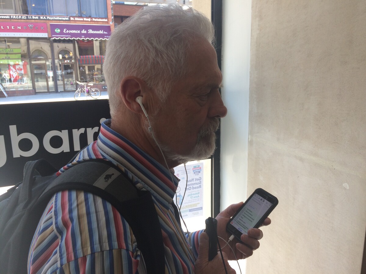
As technology advances, so do the different ways to provide information in new and innovative ways. One example includes using existing indoor wayfinding software which provides audio navigation instructions such as BlindSquare. These apps often use beacons technology, GPS or other positioning technologies to guide users step-by-step directions and provide information about key areas within buildings.

Accessible Elevators and Staircases
Elevators should always be equipped with audible announcements, well-designed buttons with braille, large fonts, and tactile elements to help users who are blind or have vision loss select floors and move safely within buildings. On staircases, ensure that the colour contrast at the edge of steps is high enough to help people who are visually impaired. Having continuous handrails on both sides of stairs not only helps users with support but also acts as a guide for people with low vision when navigating stairs. Handrails designed with horizontal extensions at the top and bottom of stairs signals to the users that they have arrived at a landing.
Clear Pathway and Colour Contrast
One way to create accessible pathways is to ensure that hallways and corridors are free from obstacles and clutter. Busy hallways and corridors prevent people who are blind from manoeuvring their canes properly. Imagine how stressful it can be when people have to navigate through busy hallways and corridors when they can't see where the next obstacle is located. Colour contrast can also be used between flooring, wall and baseboards to define the space for people with low vision. A door that contrasts with the surrounding wall will be easier to identify by people with low vision.

Consistency of Design
Maintain a consistent layout and signage system throughout the building to help people who live with vision loss familiarize themselves with the space. It can also help users develop mental maps.
Use of auditory and olfactory features, such as a water fountain or fragrant plants can also also assist people with vision disabilities to locate themselves in a building.
Minimize Echoes
Some people who are blind rely on sounds to navigate their surroundings. However, the sound created by echoes is disorienting and can make a cane user take the wrong path.
Designing pathfinding for people who are blind or have vision loss in the built environment is an important aspect of accessibility. It is therefore important to consider a holistic approach as people who are blind or visually impaired have individual needs. Keeping these features in mind will help you create a space that is welcoming, navigable and safe for all to visit.


