Essential Tips for Making Your Document Accessible to People with Dyslexia
In today's world, communication occurs primarily through digital mediums. While these mediums offer great opportunities to enhance communication, they can also present challenges for 10 to 20% of Canadians with dyslexia. Adopting these best practices will make most written communication easier on the eye for everyone.
While the following list of tips and best practices is not exhaustive, consider them to ensure that your communications are accessible to people with dyslexia.
Clear and Concise Language
Use plain language to simplify communication, and ensure clarity and accessibility for all readers. Keeping your communication simple and to the point helps complex ideas become easier to grasp.
Add visuals to your content
Support your written content with visuals such as images and diagrams when possible, as they provide alternative means of understanding for people who take in information differently. In addition, provide alt-text for images as some people with dyslexia use screen readers.
Break Content into Digestible Chunks
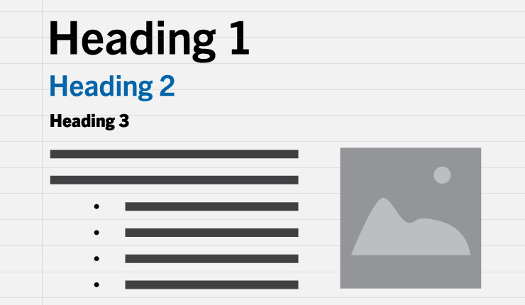
Large blocks of text can be overwhelming for some people with dyslexia. Break your content into smaller paragraphs, use headings, styles, bullet points, or numbered lists to create a consistent structure and highlight key points.
Use simple and readable fonts
Use sans serif fonts such as Arial, Calibri, or Verdana for stronger readability. Alternatively, consider using the font FS Me, specially created for people with learning disabilities. Avoid fonts with uneven line weight or closely compressed letters, as they can make letters appear merged together to some people with dyslexia.
Visual styling
Avoid underlining and italics, as that can make text appear to run together and cause crowding. Instead, use bold for emphasis. Furthermore, avoid text in uppercase/capital letters, as that can be harder to read.
Font size
Increase font size to enhance readability, with a minimum of 12 to 14 point font for regular documents. For headings, use a font size that is at least 20% larger than the normal text.

Spacing
Improve readability by having inter-letter/character spacing at around 35% of the average letter width. Moreover, inter-word spacing should be at least 3.5 times the inter-letter spacing. Larger line spacing, preferably 1.5/150%, provides more space between lines of text, which will reduce visual crowding.
High contrast colour
Use sufficient contrast levels between background and text, and avoid background patterns. For instance, choose dark text on a light (not white) background, and consider alternatives to white backgrounds for paper, computer screens, and visual aids such as whiteboards.
By implementing these tips and best practices, you will create documents that are accessible to most people with dyslexia.
References
1. Check Text and Background for Sufficient Color Contrast
2. Design Slides for people With Dyslexia


